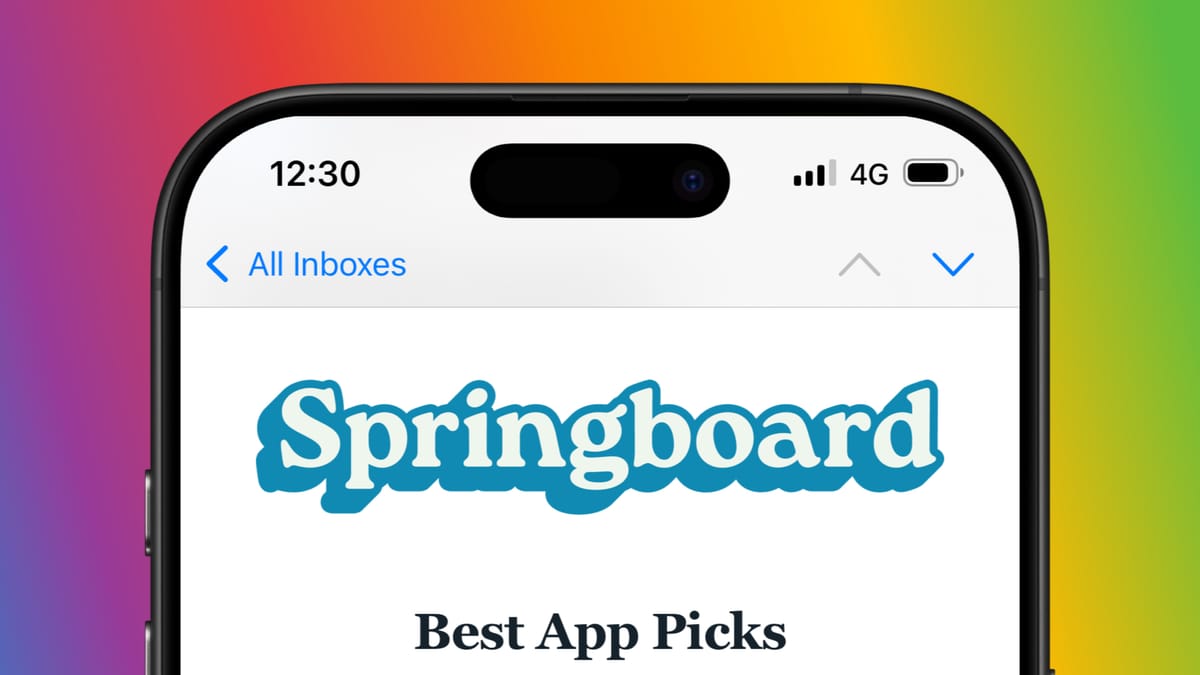
App Picks - May 2026
Below are some great apps that you should try out - all made without AI

If there's one thing I've noticed about Apple app coverage in the past year, it's the lack of those made without AI, or some that showcase useless front-facing AI features. I've seen plenty about agents, vibe-coding, and more that, to me, miss the point of what an app is meant to be for a user.
To me, software should solve a problem and be as accessible as possible to as many human beings as possible. It shouldn't be made from a few requests and then binned once its use is fulfilled. Many are falling for this narrative and failing to see the bigger picture. It's something I hope Apple can help with at WWDC, being held from June 8 to June 12 in San Jose.
With all this in mind, I wanted to again highlight five apps available on iPhone, iPad, Mac, and even one on Windows. All have some fantastic use cases for a wide variety of users, which have been created without AI - instead made from talent and years of experience.

Indigo
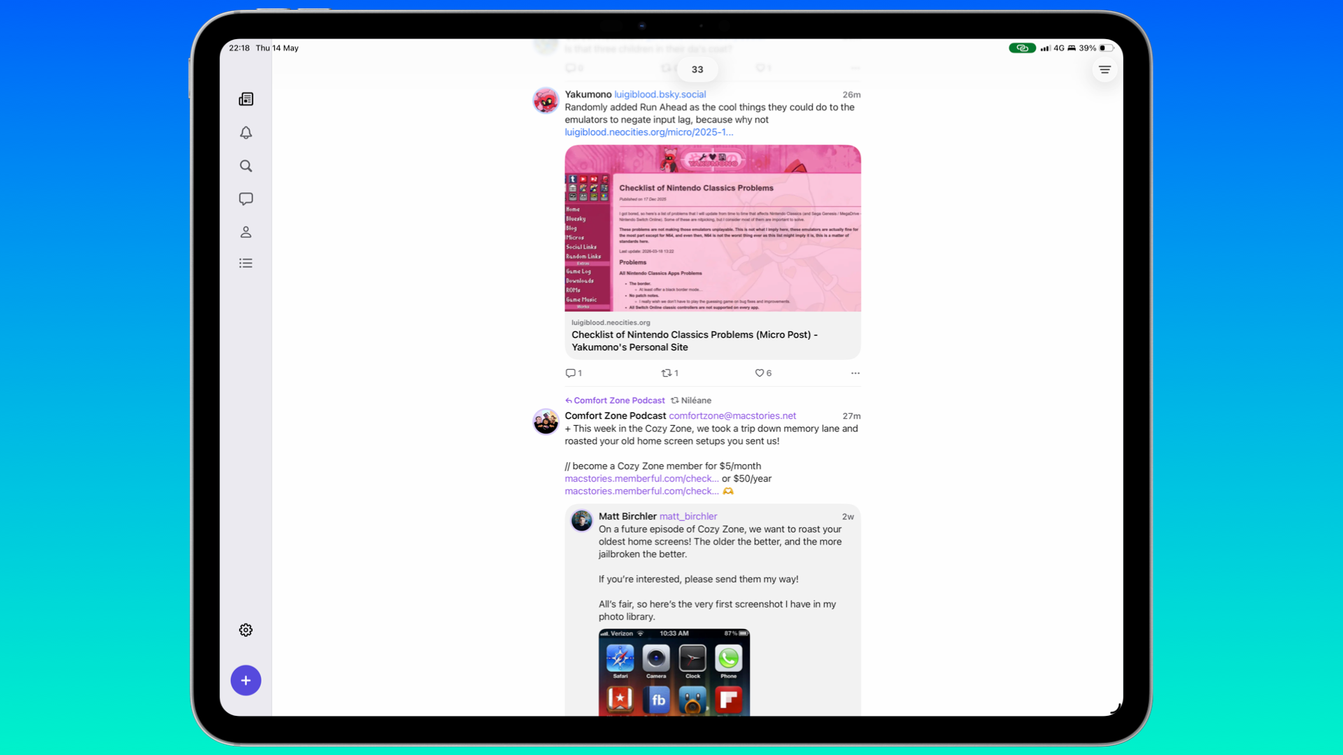
Social media has been in flux for a few years now. It used to be Facebook and Twitter before things changed around 2022 because of Musk. As things stand, it's Mastodon and Bluesky, followed by X for some still on there. But if you're using both Bluesky and Mastodon, it can be a hassle to manage both accounts.
This is where Indigo comes in. Developed by Soapbox Software, consisting of Aaron Vegh and Ben Rice McCarthy, both of whom you may know from the cross-posting app, Croissant, you can view both timelines from Bluesky and Mastodon at once. It's available for free on Mac, iPhone, and iPad in a read-only mode, but you can pay to unlock it for $4.99 / £2.99 a month, $35 / £22.90 a year, or $120 / £77.99 for a lifetime purchase. But it would be nice to have a free trial here, just to give new users a peek as to what Indigo is capable of.
Having used Indigo for several weeks, I'm not surprised by how well it's designed, considering McCarthy is known for the camera app Obscura, as well as Ketchup for Pokémon fans. Scrolling through the merged timeline is easy enough, and I've been posting about previous Springboard issues without any bugs.
I had a quick chat with McCarthy to mark Indigo's release:
Having used Croissant, Indigo feels like the definitive follow-up - how does it feel to have it out there since the initial plans back in 2024?
Around February of this year, we felt that we were a couple of weeks away from launching, before realising that we were way overdue on setting up a shared company. That took a few weeks, and setting up a new developer account with Apple took even longer. So we’ve been ready to go for a while and just waiting for all the bureaucracy to be done. Finally, shipping feels like a huge weight off our shoulders after all that, and it’s great not to have to be cagey about it any longer. I’ve almost posted screenshots of Indigo accidentally more times than I can count.
Is there something in Indigo that took a lot of time to get right, but users may not notice?
There’s just a stupid amount of work that goes into fetching posts, merging the posts into a single timeline, and displaying that in a way that feels seamless. If one service takes longer than the other to fetch posts, then the timeline could start jumping around as new posts are inserted haphazardly, so that requires a lot of care to get right.
Did you both come across any challenges during Indigo’s development?
There were a million challenges, but the biggest has just been getting the timeline working to the level of quality users expect. At first, you think it’s just a scrolling list. How hard can that be? But then you start factoring in things like media and link previews loading in asynchronously, which changes the layout of a post, which changes the offset of every post below it.
Meanwhile, new posts are being added, occasionally posts are deleted or moved (if they’re reposted, for example), and you have to account for all of this, while the user is scrolling and the display is updating 120 times per second. It’s still not perfect; there can be some occasional choppiness that we’d really like to eliminate, but I cannot overstate how much it’s improved over the last six months.
You've mentioned that a bunch of features have been pushed back that have pained you - anything in particular that was difficult to cut for now?
None of the cuts felt more painful than how good it feels to launch now. We did launch with mute filters, but I think there’s a lot of room for improvement there, and a few novel ideas there that I want to try to implement. Being in control of what you see is so important to having a good social media experience, so I really want to work on that soon.
We’re weeks away from WWDC - is there something you and Aaron would each like to see that could help Indigo even more?
Right now, we’re giving 30% of our revenue to Apple because they have yet to approve us for the Small Business Program (which would reduce their cut to 15%), and that’s pretty painful. Any improvements to how indie apps are treated could be huge, though I’m not holding my breath.
From a technical perspective, I’ll take any improvements to Catalyst and making it easier to share code between platforms, while still maintaining the Mac’s fit and finish. On iOS, we created a custom tab bar because I’m not happy with how inflexible the system tab bar is. I’m hopeful that after a rough year of Liquid Glass weirdness, it sees a lot of refinement.
Passable
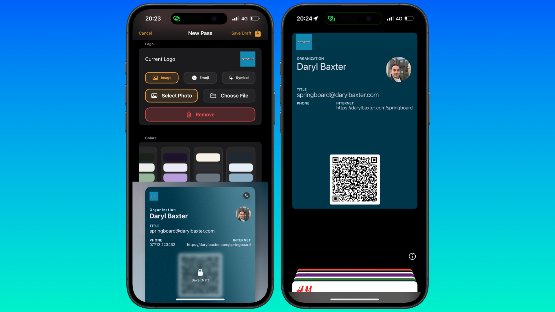
Sometimes you'll come across an app that overlaps with something you've been occupied with. Passable, developed by Angelo Marcello, has a 'why hasn't someone developed this before' vibe. In a few minutes, you can easily create a contact or business card that can be saved in the Wallet app.
Using the generated QR code or other means, you can easily pass on your personal or your business details to another user. It's incredibly simple, and I've already got one ready to go. Passable is available for pre-order, but I've been trying it out via TestFlight. I can see this app doing well once it's available on July 15. All I'd like to see is more color gradient options and a way to customize the QR code, such as colors or the option for it to have a different link.
PureMac
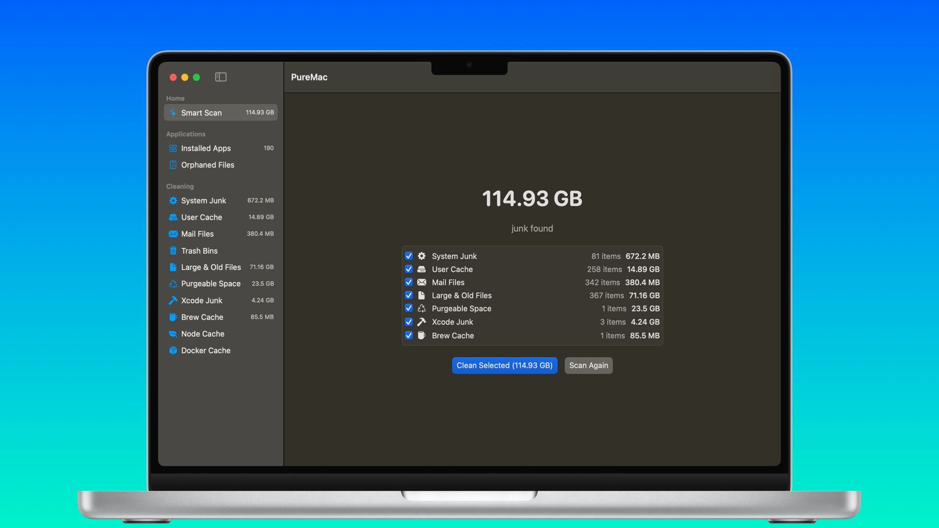
Your Mac's likely clogged up. Not by dust, but by all of the leftover and forgotten files that have built up over time. You think the features in Settings > Storage will help free up some space, but it doesn't completely uncover the files that are filling up your Mac. Some apps can help with this, such as CleanMyMac, but they've become so bloated that some were looking for alternatives.
This is where PureMac comes in, borne out of frustration with apps like CleanMyMac. It's free with a low download size of 2MB, which quickly scans everything in your Mac to see what can be deleted. What surprised me was how quick everything felt, which only shows how bloated other apps have become. I managed to recover 22GB of space, and it took seconds. If you're looking for something similar, I strongly recommend PureMac.
InYourFace
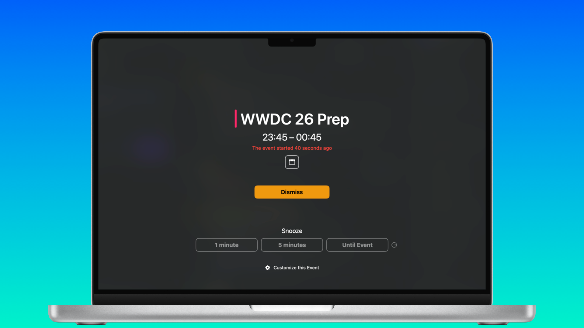
It's safe to say that I've been in plenty of meetings these last few years for the books and other things. I always make sure there's a five-minute reminder before a call so that I'm ready to go and the dog is chewing on a bone so he doesn't disturb me. But I admit, there have been rare times when I haven't set that reminder, and I'm getting panicked messages.
So InYourFace, developed by Martin Höller, is a perfect failsafe. Once you allow it to access your calendar app of choice, the app covers your Mac's display (or iPhone /iPad) to indicate that a meeting is about to start. You can decide to press one of the three Snooze buttons at your peril, but then what would be the point?
It's free to use, but after 20 alerts, you are required to pay. This can be $3.99 / £3.99 a month, $24 / £22.90 a year, or $69 / £77.99 for a lifetime purchase. InYourFace was also recently made available for Windows, which feels like a perfect fit for all those Teams meetings.
PageTurn
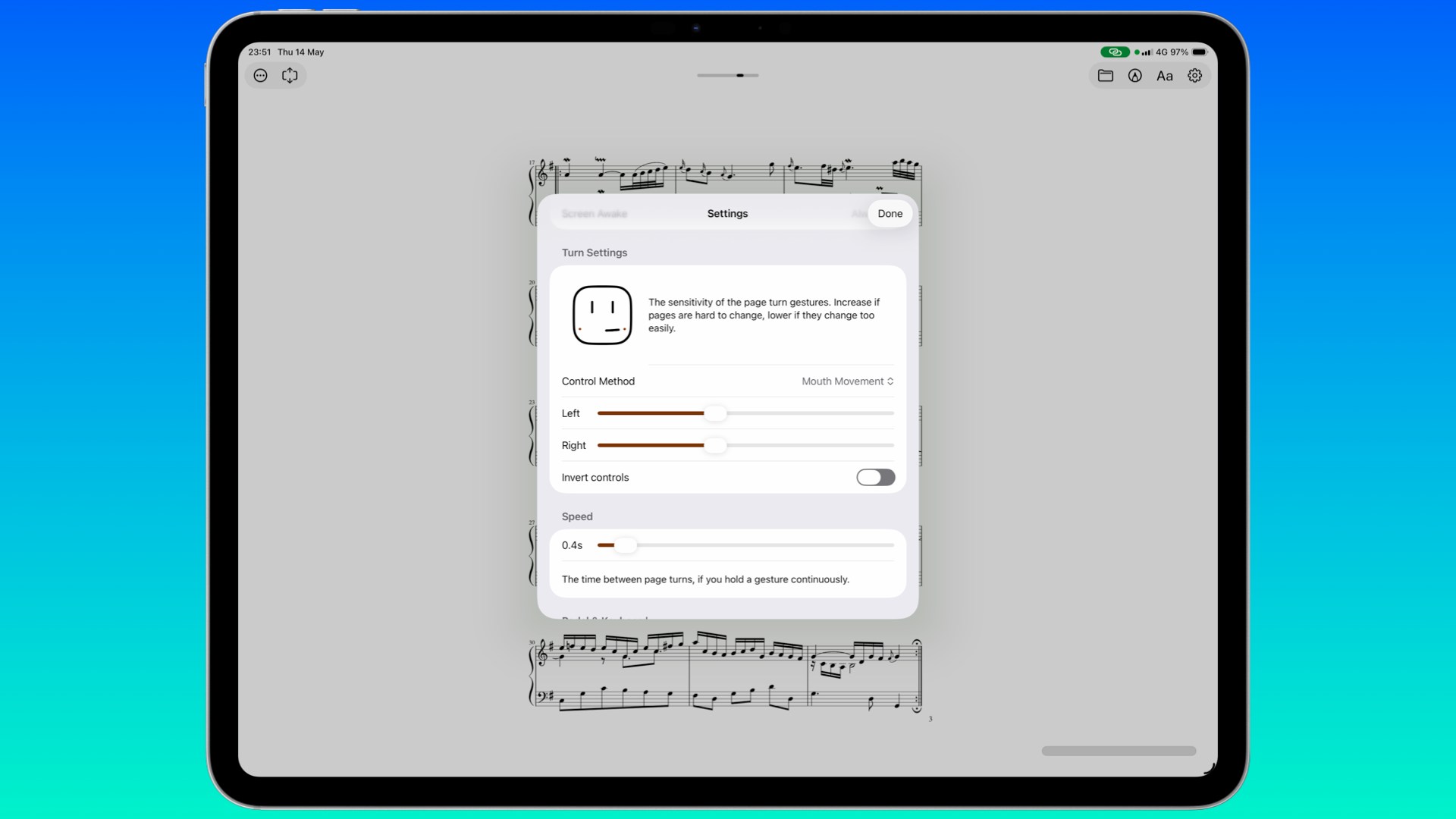
Who'd have thought that turning a page with your face could be so much fun? PageTurn, developed by Stephen Coyle, is mainly designed for musicians so they can keep playing their instrument without having to stop to go to a new page. It does this by having the app track your mouth or eye-blink movements. I found myself doing both like a maniac for ten minutes with the sample pages, and I was impressed.
Admittedly, PageTurn has been available for several years, but a new version recently shipped that adds eBook and webpage support, as well as the ability to use keyboards and pedals to turn pages as well.
Available for $1.99 / £0.99 a month, $19.99 / £8.99 a year, or $9.99 / £9.99 for a lifetime purchase, this is also amazing for accessibility users - so much so, I'm surprised there's not a similar feature offered by Apple Books. However, despite PageTurn being mainly for musicians, I'd love a way for the app to find local files and display them in one place. I have plenty of comics and magazines on my iPad, for example, so to easily open them here, whilst the iPad is an arm's length away, would be ideal.
We're weeks away from WWDC, where we'll likely see some much-needed improvements to Liquid Glass in iOS 27, iPadOS 27, and macOS 27. This will trickle down to some apps, and I'm looking forward to it. But if you've also gotten tired of seeing coverage about apps getting AI-focused features, hopefully, a few of the above will give you some needed fresh air for your Apple device.
Thanks for reading.